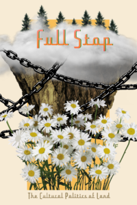

 Raymond Pettibon’s body of work spans roughly three decades. He got his start alongside the LA Hardcore scene of the late 70s/early 80s, designing flyers and album covers for bands like Black Flag and The Minutemen. In his early work, honed a distinct drawing style using mostly Indian Ink and watercolor. The pieces always included an omnivorous pallette of images, accompanied by a substantial text component, and featured historical moments, baseball, americana, serial killers, sadomasochism, and silly childlike wonder, among countless others. His imagery revels in anachronism — contrast is central to his humor — mixing pop culture with classical critical theory, or popular cartoon characters with the bible.
There are pieces depicting Gumby holding a gun or Charles Manson standing over a gruesome bloodbath, reducing everything to a sinister narrative, usually with an element of theater or noir. He is confessional, yet insincere; topical, yet discursive. Some of his works could be torn from a suspectedly sociopathic child’s secret notebook.
The David Zwirner Gallery in New York City currently has a selection of his new pieces on view. And though he peppers in many of his traditional themes, he pays particular attention to his feelings about the writing process. In one piece, the words, “iyt makes me dull to wriyte,” are scrawled in light pencil on the white gallery wall. The added Ys are one of the artist’s trademarks in his current work, as well as his prolific twitter account, where he seems to do most of his free-associating these days.
Another piece reads “On the other hand, the whole business of writing demands a lot of verve, and I just don’t have it anymore; it doesn’t seem to matter.” It’s made to look like a note on stuffy formal stationery. A faded black worm-like shape sits below the words. Elsewhere on the wall, he writes “my words are considered proof of a hate-filled soul” and “I have often thot abouyt death more than I’ve wriyte iy’t.” This regressive experimental spelling project is perhaps Pettibon’s throwing up his hands with regard to communication. Or maybe it’s all trivial. Maybe it’s aesthetic irreverence for its own sake. Either way, he consciously chooses to engage with language as part of his process.
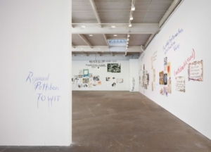 The show’s title, To Wit, is a fitting non-sequitur. Meaning “namely” or “that is to say,” the phrase requires an antecedent of some kind, although in Pettibon’s case, it does not. Much like the work, it is meant to dangle without context, explanation, or resolution, which is far from a criticism in his case. Even at his most subversive, Pettibon strikes at the heart of human experience. His jokey-apathetic musings and surreal depictions of extreme violence are somehow poignant and accessible.
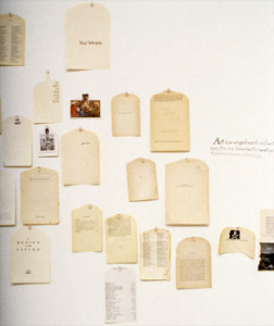
The most incongruous piece, a collage made of the title pages of classic literary works cut into the shape of tomb stones and laid in a tessellated pattern, includes nonsensical one-liners scribbled in red ink at the bottom of each page. There is a grand finale quality to this piece, a place where the themes of the show all converge — his obsession with the death of art/writing, the mixing of high- and low-brow expression, the deconstruction and reconstitution of objects and the decontextualization of language and words.
This post may contain affiliate links.