

 [powerHouse; 2014]
Cover is a book of book covers and jackets produced over the last ten years. The author, Peter Mendelsund, was hired as designer at Knopf about a decade ago, after deciding that he was no longer going to be a classical pianist. In fact, if we go by the text in the introduction, the new occupation is part of the recovery process from the previous one.
The catalog is slick. On its cover, there is the picture of a little book wrapped in a magenta red fabric. It comes in a transparent plastic jacket and has a bit the attitude of a ‘book of books’.
Inside, the images of covers are organized in sections by literary genre and include a small selection of trial designs that never saw the light of publishing. Sporadically, we encounter text: citations and aphorisms, longer contributions by other authors and a Q&A at the very end. The writing is neither particularly exciting nor says anything unheard of about publications and their making, but provides some curious details for the ones interested in Mendelsund’s practice.
Like most volumes that live a parallel life as design objects, Cover calls attention to the physical life of a book. To be more precise in this case, it belongs to that group of publications that one instinctively relates to the gesture of flipping through or skimming, rather than reading. I might go as far as saying that I already see Cover lying on some coffee table in a waiting room. Clearly the even cruder point is that belonging to a coffee table has never equalled a doomed lack of quality or depth.
Instead of thinking books in terms of ‘belonging’ in a particular space we might think of them in their alliances with other cultural and art objects and in terms of their capacity for expanding our sensorial faculties. This is especially true for a book like this one. It connects directly with the cultural objects it catalogs, which are books themselves, and these are, by nature, dense of content — material content, thoughts and stories — and expansive, as those thoughts and stories reach out for other cultural objects and then other objects and so on.
 First off, Cover works as a cognitive trip-map for an imaginary multi-location library. As I go through the pages, I connect the photos of designed covers to books I own/would like to own, and the places where I saw them last: the desk, a row of wooden shelves, a train seat, the cart for book collection at the library, the reduced section of the bookstore, some cardboard box bound to the charity shop. The Girl with the Dragon Tattoo is there, Plato’s Republic there, my Calvino collection there, next to the Kafka one, and then Basho’s haikus. It is an exploded library of insignificant instances of book cravings that Mendelsund’s work helps me map out. Each cover corresponds to a book to then match with a place or an instance. This relation is not much one of representation, in which the drawing or photo on the cover represents the content inside, but more of an image-correspondence: the thing, colour or set of lines I visualize when I think about that book and what’s inside it. Under this light, Mendelsund’s design work acquires a quite crucial role in my existence as a reader.
Second, there is the place that Cover itself, the tightly compressed capsule of all these other places, occupies in my mind. So then there is Mad Men (the TV show), Manhattan smoky offices and the tireless inception of suggestive concepts, apt for selling women stockings as well as slide projectors. Three or four people in a room complete each other’s thoughts and hint at a micro story that passes a message across. The images are either stylised or cinematic, but all are witty and digestible. Not incidentally, another possible consequence of digital reading is an apparently tighter relation between books’ marketing and their design and look as physical objects. Somewhat ironically, this seems particularly true for philosophy books. A brief digression, even more ironically, as Italian, I have always been puzzled by, if not jealous of, the look of certain philosophical texts in their English translation. The average Italian reader of Agamben has a collection of boringly looking, small volumes, with mono-colour covers and conventional text grids. Nothing to do with edgier almost-square dimensions, intriguing cover images and designed layout.
Now, the kinds of stuff collected inside Cover and Mad Men do occupy neighbouring regions of cultural consumption and perform the same role within the cogs of contemporary market. But I believe that the cohabitation in a very specific section of my mind of Cover and Mad Men, as commodities themselves, is mainly due to their shared liquid taste, typical of fine first class products.
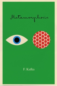
The book is well crafted and reflects many of Mendelsund’s design choices, which are elegant, smooth and easy to process for a consumer. The covers’ styles range quite broadly. They are rich of visual inventions that strategically link each book to its jacket and always strive to pre-figure the general atmosphere of the text. There are the ones with more straightforward symbolic images that stand for the title and potentially the content, like most of the designs for books by Foucault (nested dolls for The Order of Things, a coiled spring for The History of Sexuality). The ones in which the selected front picture is evocative of a collective imaginary already existing around a book, like in the case of the American translation of Doctor Zhivago. There are also series that explicitly avoid representing or encapsulating the book and instead pick up its underlying vibe. In the paperback collection of books by Kafka, the puzzling eyes looking out from the jacket can be weird, surreal and ironic all at once.
 One of the more interesting graphic solutions remains the paperback version of The Future of Life, the fist title that Mendelsund designed on his own. A small text in the first part of Cover explains the story behind that project. The author, Edward O. Wilson, had chosen a picture for the cover of his book: a lush painting with a complex composition of plants, birds and other amphibious animals. The image, emblematic of a chaotic and gorgeous nature, is too confusing for the viewer to work well as a book cover, too many details and colours. Therefore Mendelsund decided to isolate one detail, a small orange/yellow frog in the bottom left quadrant of the image. He accomplished this by having the original picture printed on the third page and using as the cover a black colour-block front jacket, with the author’s name and title and a small hole corresponding to the position of the frog on the underlying painting. The idea is simple and smart. It amends the design problem and catches a central aspect of the book: to look at nature in its specificities and its ecology at once.
One last place Cover brought me to, before ending this review, is indeed quite predictable: Walter Benjamin’s home as he unpacks his library and writes his reflections on book collecting (published among other essays in Illuminations). In that small text, Benjamin talks about the act of collecting, more than books, and of the various methods we have to accumulate significant amounts of stuff of similar nature or comparable categories. In the case of books, there is: inheriting from somebody else, writing — the more time-consuming and demanding method, but the one with higher status — and purchasing in different settings. Effectively, for Benjamin, every system of accumulating volumes but reading them is good. Cover reminds us of another less-considered modern method for collecting: designing the covers. So, being a collection, in the very material meaning that Benjamin uses, is the book’s third parallel existence.
Collections have a screwed-up relation with time and odd ways of making us muse over the future. For instance, an imaginary auction to take place in a century or so will be very similar to the ones young Benjamin used to attend, with pathos and a great deal of attention for each volume’s edition and manufacture. Additionally, due to a then-inextricable relation between a book and its look, the dealer might put a special emphasis on the designer’s work: The Future of Life by Edward O. Wilson in the version with Mendelsund’s dust jacket or The Wizard of Oz with its rainbow image, a traditional Mendelsund. If this will be the case, then Cover might become in one movement the ideal catalog of those rare collection objects, the rarest of them all and the one that somewhat collects them all.
Silvia Mollicchi is a writer, co-founding editor of Fungiculture, and is currently based in London.
This post may contain affiliate links.